Monday, 3 February 2014

4741_Poster Design

My Concept:

All I am focusing on my poster design is simplicity and easy understandable. On my poster I have used typography and illustration to create the poster. On my poster, I am showing subjects, which I am studying at AIT and the one which I want to be better in future and develop my career into it.
I have use the words ME DESIGNER and create the man with simple typography style, who is holding the rope attach to the balloon which has logo of the some design software. With the help of the balloon he is flying in the sky. I have used 6 logos of the software that I am interested in the balloon.

In the poster what I am trying to express about my self is, that I am enjoying what am doing now and it is helping me to reach goal which I was dreaming about. So, I as a designer flying up in the sky, which meaning I am doing better and better day by day and moving forward on the field which I am interested on.  

Monday, 20 January 2014

Saturday, 18 January 2014

My inspiration:


My inspiration:

I am an art person, who likes anything related to the art either it is drawing, painting, sculpting or photograph. I love images. I am good with images then the words. I think about, making letters of the word beautiful then the meaning of the words. I used to search the images in my textbook when I was kid and now too.
There is not specific artist whom I follow, but I love the art of the Erik Johansson great photo manipulation artist, Christophe Gilbert photo manipulation artist, Paul Rand graphic design and many others artist whose works inspire me. I like photo manipulation and typography. I want  to put the typography and the photography together and create beautiful and meaning full piece of art.  

Tuesday, 14 January 2014

Me designer.

Me designer.

I want to be a freelance graphic designer. I love images, I love to create images, I love to take images, and love to manipulated them. I found much comfortable with images then the words. I can express myself better by images then the words. But when it comes about the words, I see it as an image, the shape of the letters attract me more then the meaning of the words. Typography is my subject of interest as well, which I want to put in my image. I think it helps to give more depth in the art. I prefer to create some meaningful image or some informative image rather then just creating a beautiful image. I would be more happier if my work helps to change someone's life or inspire someone to do something good then I earn some money from it.  

Thursday, 9 January 2014

4741_Postcard

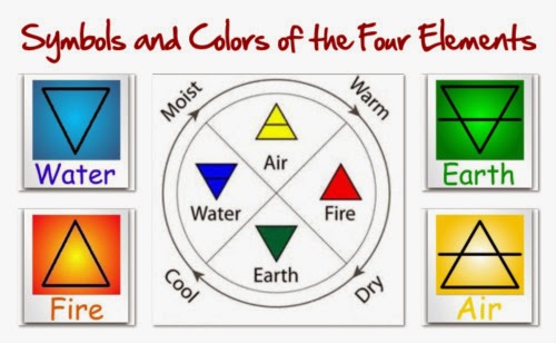
Four Classic Elements: 

Air

Earth 


Fire


Water


The concept of my postcard is about four classic elements Air, Earth, Fire and Water. Here in this postcard I have use Alchemical symbols which is in triangle form represent the four elements according to the ancient Greek science and philosophy. The triangle it self is supposes to give the meaning but I found it is not so interesting also it will look like meaning less for those who are unknown about the Greek ancient history so I played around with the triangle and put color to make is easy to understand for all.

Air: The triangle pointing upward and horizontal line through middle of it represent the Air according to the Greek ancient alchemical symbol. Instead of only using the one triangle I have created the many triangle without destroying the shape of the triangle. Air represents the sky, a open space. So I have use blue background to represent and used the triangle to make it look the clouds and gave them the grey color with white background. I have put the cloud on the top to make feel of floating in the air and left the space on the bottom

Earth: The triangle pointing downward and horizontal line through middle of it represent the Earth. Here I have put the triangle in the pattern because when it comes about earth we can see field, tree, which is kind of makes pattern as well. I have use dark brown, light brown and green color.

Fire: The triangle pointing upward represent the fire. I have used red and yellow with back background to give the contrast on art. I used triangle and tried to make it look like the flame of the fire, which is more understandable for everyone.

Water: The triangle pointing downward represent the water. I have used triangles to make it look like the wave because water represents the ocean and ocean got waves. I have use dark blue and the white border for triangle to make wave and blue for water. 


Tuesday, 10 December 2013

Non Objective arts.

Non objective is abstract art, which is the combination of the color and lines to create art. Artist can express their idea, creativity and expression through the colors. It is really important to understand the color to understand the non objective abstract art. Colors express the mood, feelings, and also many other factor. The arts which consist of any objective form like any particular shape of tree, leaves, stone are not categorizes as the non objective art. But we can represent those object by the color or any geometric shape. Also the flow of the stroke and the paint is really important in the term of  non objective art. Contrast of color is very effective in the non objective which gives more depth in art. As well composition is really important like how the space at art board id utilized. Too much stuff may confused the viewers and the less stuff may make viewer bore. So it is really challenging to draw the non objective art then it looks like.


                                                              Fig: YingYang Variations # 3
This geometric image is an archival digital 36 inch x 36 inch square semi gloss print which is hung on the diagonal.

 Refrence: http://www.srcstudios.com/abstract-nonobjective.htm